Mapping World Languages' Difficulty Relative to English
Editor’s Note: This post is best viewed on the original website EducatorsRLearners
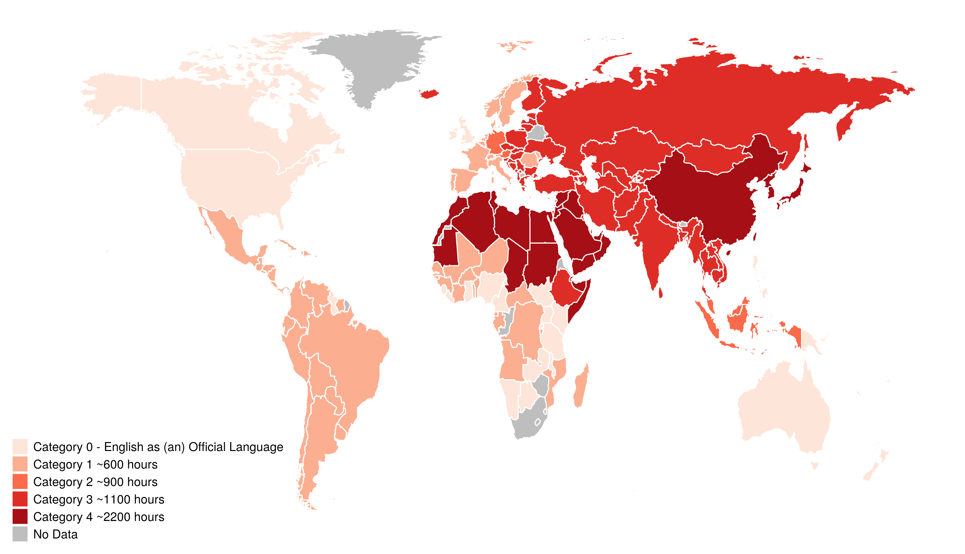
I was reading r/MapPorn and saw the image below:
As fate would have it, the very first comment was from Guridkt who said, “I’d like to see asia too, i wonder if there’s a map of that. (sic)”
So would I, so lets do it.
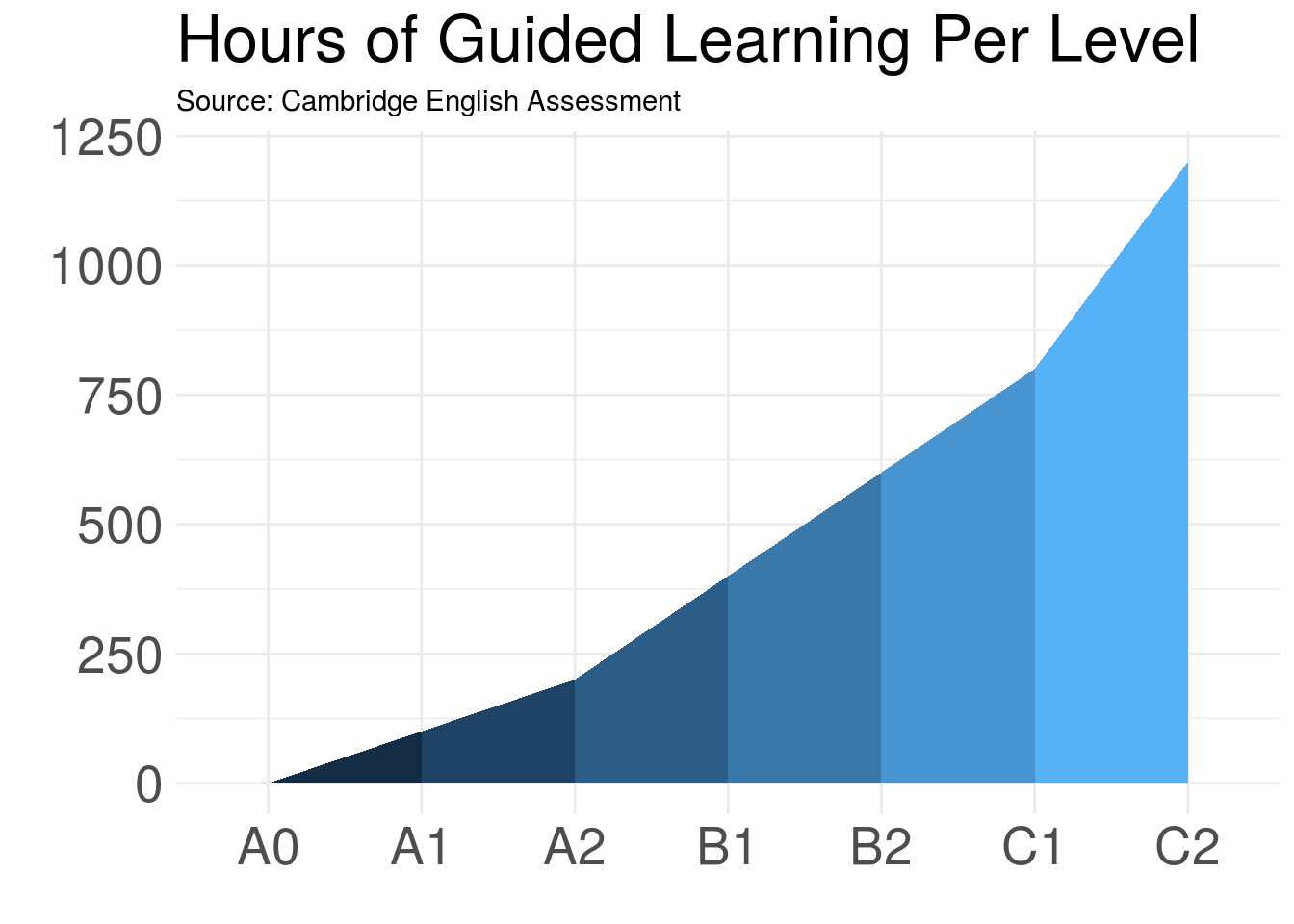
About the Data This map is based on data published by the US Foreign Service Institute and, according to their website, it is based on the institutes’ “70 years of experience in teaching languages to U.